Well Buying Industrial Co. - Website Redesign
The freelancing project was requested by Well Buying Industrial Co. Ltd. Clients’ initial need was updating the organizational website for a better experience for clients and employees in product search and information purposes.
Project duration:
December 2020 to July 2021, and currently ongoing consulting for product updates.
Project Member:
2
Role & responsibility:
Primary: User research and information architecture design
Secondary: Minor graphic redesign & product rendering
Project overview:
The Problem
The client listed multiple website redesign requirements as follows:
A modern and simplified layout with a clean interface.
Including product search function.
Including multiple versions of websites in the language of traditional/simplified Chinese, Japanese, and English.
Horizontal layouts.
Better backstage design for information management and website maintenance.
Direct links to the organizational email,
Project Goal
Redesign the user journey for clients and employees for better access to product information with simple search functions and customized research options.
DESIGN SOLUTION
Key feature
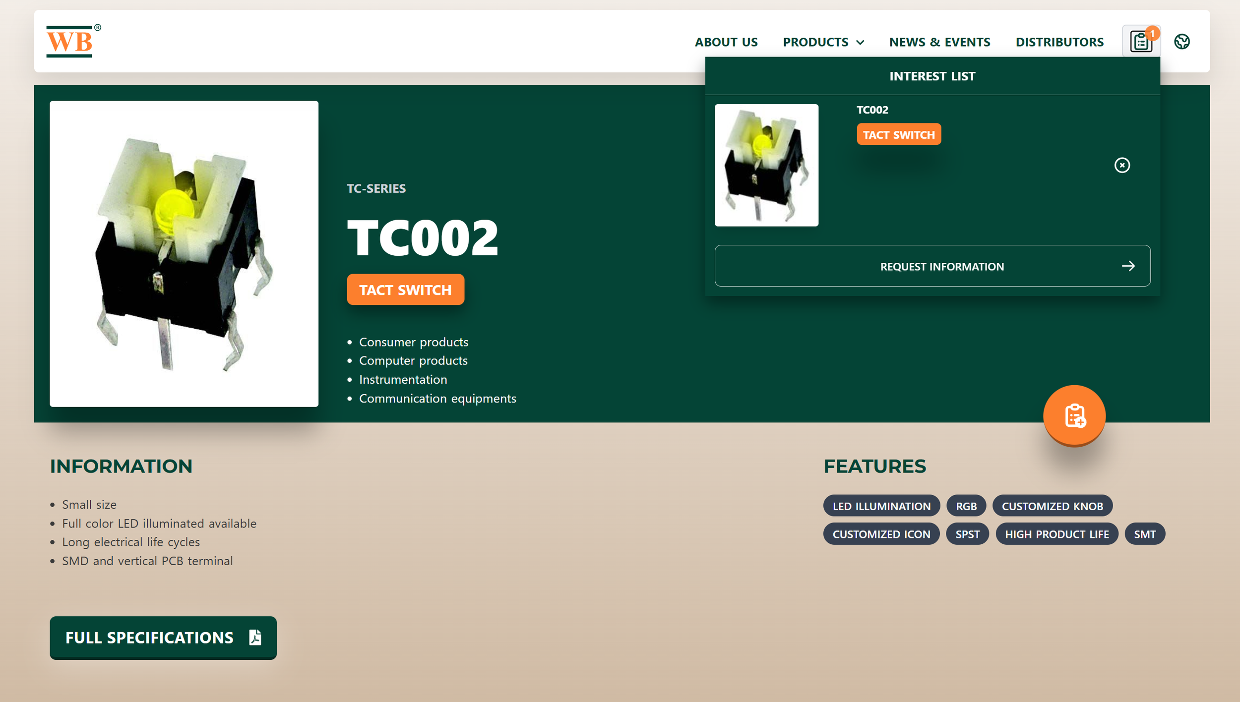
Product Search
A crossed funtion product search function by serial number, product categories, or product features.
“Shopping Cart”
An “ordering” feature that records clients’ request history.
Direct Message
Allow clients to provide detail information and concenr about the ordering with a direct communication form.
Please visit the link below to interact with the actual website.
https://www.wellbuying.com.tw/
RESEARCH DEVELOPMENT
Evaluating the Original
Captions of the original website
Infrastructure visualization of original website
Original webpage information architecture
The original website was formed with a single-directional user flow, so sections do not interconnect or interact with other subpages in the same categories.
user research
Round 1 Survey: Quantitative
The text is formed in Mandrian for our majority users and clients.
The first survey focused on Yes / No, single-choice, and short-answer questions to develop a fundamental understanding of user paint points.
Survey 1 Outcome
The text is formed in Mandrian for our majority users and clients.
Survey 1 Insights
Internal employees only occasionally use the company’s website to demonstrate their products, but external clients use it as their primary product research method.
Internal employees have alternative ways to research company products; the website is not the first choice for most users.
The information is mostly outdated.
The website is missing most of the key functions for product ordering.
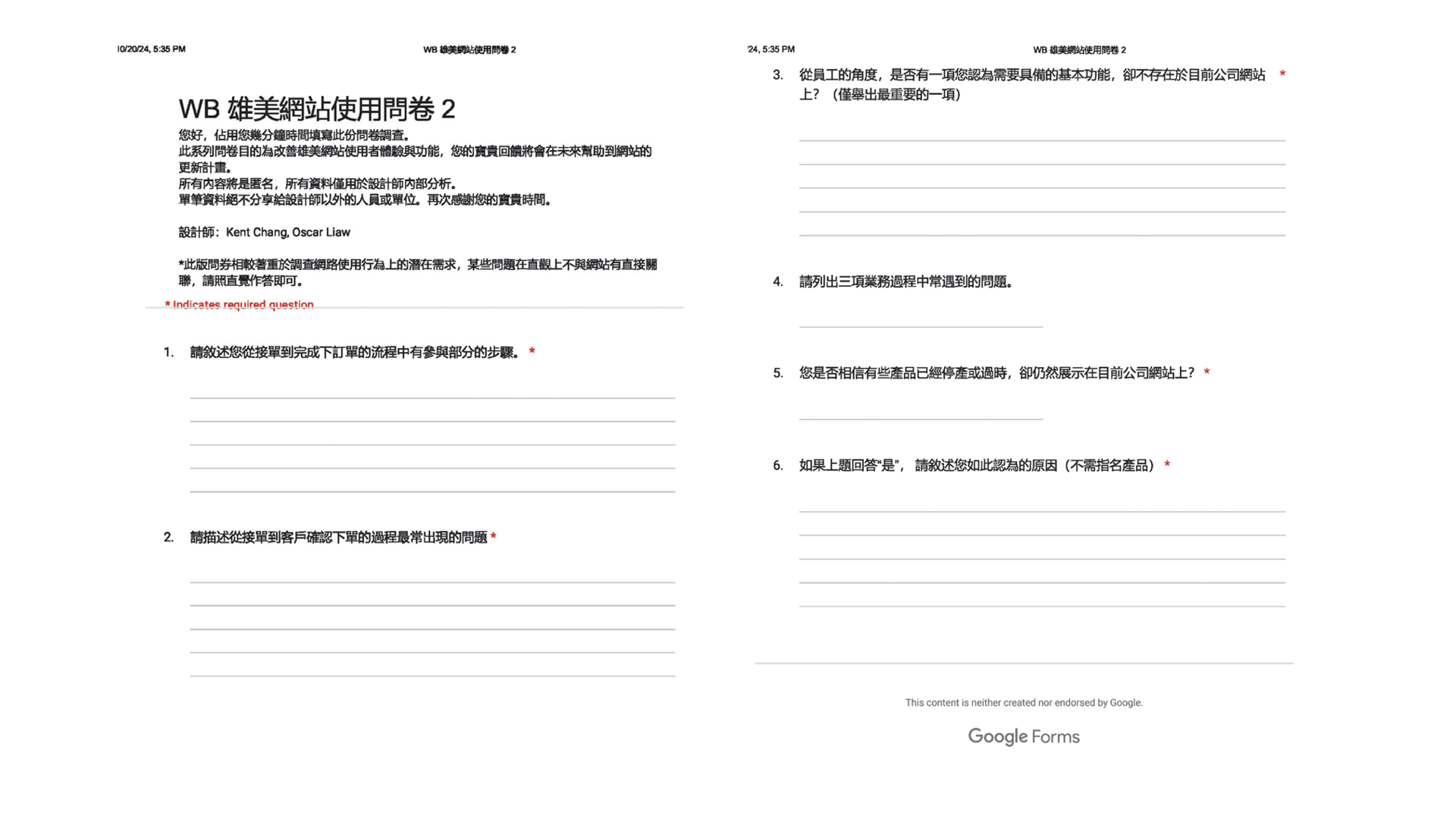
Survey 2: Qualitative
The text is formed in Mandrian for our majority users and clients.
The second survey includes open-ended questions to develop in-depth knowledge of user paint points and primary design opportunities.
Survey 2 Outcome
The text is formed in Mandrian for our majority users and clients.
Survey two Insights
The website does not have a “search” function for a fast and effective path to product pages.
The website does not have functions that support the business process.
Product information is not up to date, which creates business issues for clients ordering products.
Interview
A verbal interview was performed with the company representative to detail collected insights and determine the urgent changes; due to potential budgets and technical requirements, some design concepts may not appear in the final deliverable.
Overall Insights: The Must For The New Website
Product search function.
Modern user interface.
Allow the website to be the platform that supports the company’s business activities.
Multi-language functions.
WEBSITE DEVELOPMENT
Website Infrastructure Design
Redesign webpage information architecture
The redesign of the website infrastructure focused on categorizing products with the organization’s standard for helping users find their needs in a more simple process for contacting employees and providing product information
User Journey
The guideline for website construction is based on potential critical pain points highlighted in the user journey to enhance primary website purposes for employees and clients.
Initial Design Concepts
Multiple search methods: Product search can be performed using product name, product number, feature hatch tags, and category browsing.
Develop a color theme connected to the company’s logo that applies to the website.
Create a path between the website and the internal employee system (i.e., chat box).
Allow customer information to be attached for business activities.
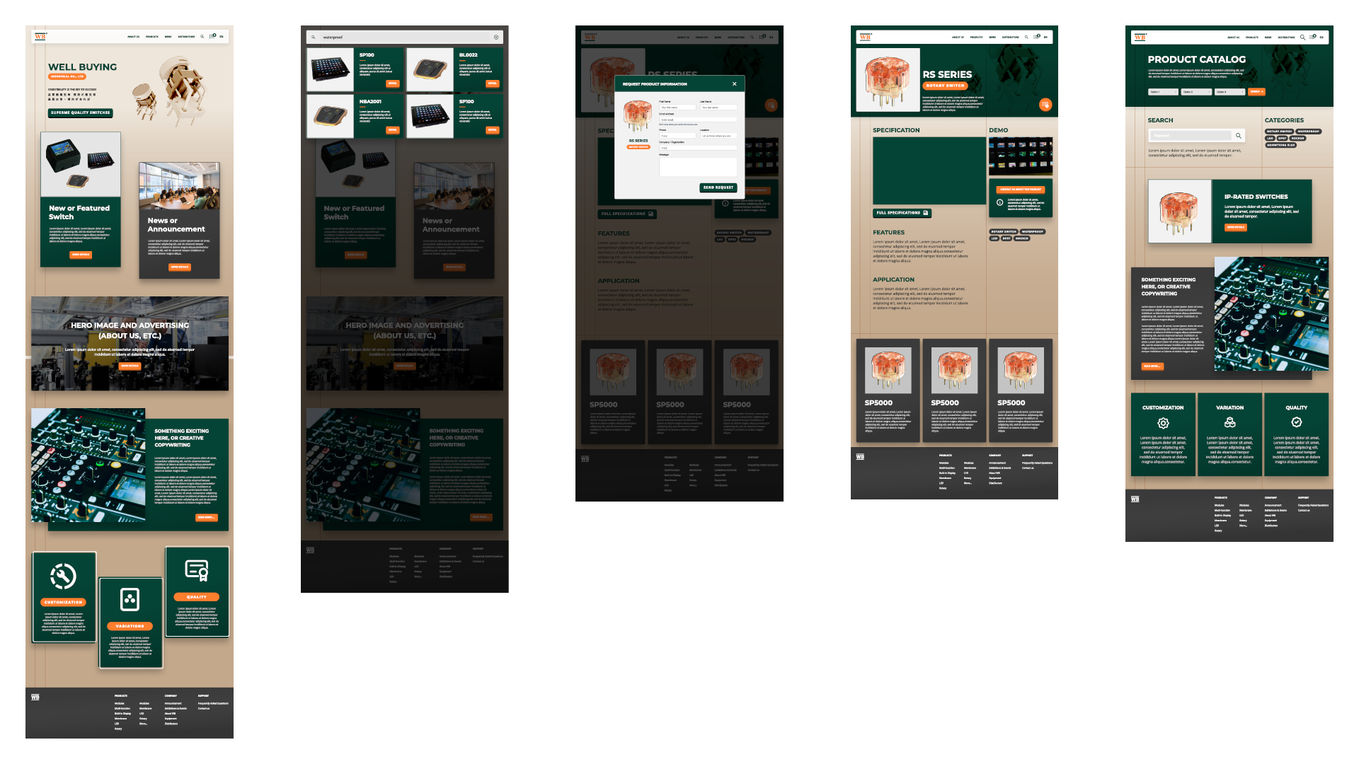
Low-Fidelity Wireframe
My partner, Kent Change, specializes in digital and graphic design. My role in wireframe development focuses on ensuring that key research insights are implanted and easily accessible to users.
DESIGN SYSTEM DEVELOPMENT
My partner, Kent Change, designed the design theme, and we ultimately agreed on the company logo's green and orange colors.
High-Fidelity Mockup
Due to the time and technical challenges of digital development in setting up the website, we presented high-fidelity mockups so the clients could visualize the essential function: Product Search.
PRODUCT RENDERING DEMONSTRATION
Product Rendering
The product rendering is performed to generate the graphic materials that may need to be put into the new website; it is also a demonstration to help the company determine how they may use rendering techniques to promote products in the future.
The key to product rendering is to provide a guideline for clients to have a basic understanding of how products can be labeled with the new website design.
Minor Graphic Iteration Design
The organizational flow maps were redesigned to align with the new design theme.


